
Mobile Optimization for Your Online Store

Mobile shopping is making a big splash in the world of online commerce. It’s an unavoidable fact, and an important undertaking for today’s ecommerce retailers. If your online store is inaccessible from any major mobile device, you’ve literally got a gaping hole in your sales funnel. If you want to plug up that hole and stop bleeding money, there are a few things you really must do.
The first of these would be to take a look at your budget and see if it makes more sense for you to optimize your landing pages for mobile browsing, or go ahead and develop a mobile application for your online store. Each approach has its merits, and you’re the only one who can decide which is right for you.
On the one hand optimizing a site for mobile use is very time consuming, and it will need regular maintenance to this effect. On the other, it is much less expensive than building a mobile application from scratch. Mobile aps make for more user-friendly shopping experiences in general, and they also add a certain element of elevated status to your business. However, these too will require regular maintenance, and the impetus will be on your visitors to keep their applications up to date, which may mean some long term retention problems. Still, it’s worth going over the pros and cons of these two approaches in greater depth to determine which is best for your site.
Reasoning behind Developing Your Site for Mobile Use
.jpg)
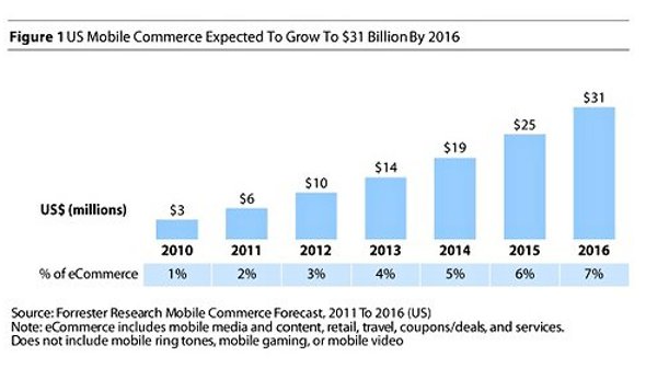
Putting together a mobile strategy for your website might not seem like it should be a big priority, at least not at first. However, when you look at recent mobile ecommerce numbers, you find that the rate at which online consumers are shopping from their smart phones is significantly increasing every year. Apply the same rate of growth to a 5 year timeline, and you begin to see the necessity.
Having an online store that isn’t accessible by tablet, Android, or iPhone is simply courting financial disaster. If you won’t cater to the needs of shoppers on the go, then your competition surely will. Recognizing this fact is the first step to cultivating a gigantic stream of revenue that will keep you from falling behind in your mission to reach the top of the online retailer heap.
The thing to remember when getting your site ready for mobile perusal, is that you have a very abbreviated amount of real estate on a smartphone screen. You can’t count on everyone shopping from a Galaxy Note, or Ipad after all. You have to assume that some very small screens are going to have to contain each and every scrap of content you are intent on displaying. That means prioritizing, simplifying, and segmenting.
Prioritizing what content on your full site carries the most weight. Simplifying the way your site looks and the ways that your content is delivered. Segmenting, not in the normal sense in which you specifically target consumers based on their behavior, location, or some other mitigating factor, but instead separating the parts of your website into clearly defined segments that can easily be browsed and recognized for their relevance to the consumer.
If you can keep these three caveats in mind while designing your mobile site or application, you’ll have a much better product by the time you’ve finished.
So without further ado, let’s dive right in with the pros and cons of mobile optimization.
Optimizing Your Website for Mobile Use
Mobile optimization has a few distinct advantages as opposed to developing your own mobile application. Foremost among these is cost. Optimizing your site for mobile is almost always much cheaper than building your own app from scratch. Of course, that doesn’t mean it’s cheap. In aggregate, mobile optimization is going to be cheaper than developing an application, but it will still require regular maintenance, and updates every time new mobile software is unveiled. However, these updates are usually superficial and a relatively small expense for the utility of a website that works well across all devices and platforms. They are faster to implement, less expensive, and universal across different devices including:- Tablets
- Smartphones
- Gaming consoles
- Desktops
- Laptops
Now what precisely makes for a successful mobile site?
Consider a mobile optimized implementation of your site as a stripped down version. I’m talking bare bones here. You want as few pages as possible, and not too many bells and whistles. Because while it may take less time to develop and launch, your mobile site will load slower than normal.
So that means you need to make everything as simple as possible. You’ll also be dealing, for the most part, with a vertical stack style of viewing. In other words, a skinny rectangular screen that will have room for one or two text columns, or a single text column with a picture included here and there.
If you’re planning to include sexy video content, it might be best to have your site linking to a YouTube account, so that your visitors can decide how to best view the video with their individual device. This is because certain smartphones have difficulty playing video embedded on websites. This is especially notable in Apple products, which have repeatedly stated that they do not, and will not be supporting Flash any time in the foreseeable future.
While you should do your best to cram information about your products or services into the limited space you’ll have available, you also don’t want to overcrowd the small space. Having an overly busy mobile site is just as bad, if not worse, than having a sparsely populated mobile site. You want to keep a happy balance that will inform your customers of the most important information, without overwhelming them with too much text.
Building a proper mobile optimized site is a chore for sure, but it’s still much easier than putting together an application. However, this hasn’t stopped many big players in the ecommerce world from slapping their brand name onto a highly functional mobile application, and for good reason. Next we’ll take a look at the good and the bad points of mobile apps, as well as a few of the best practices for their launch.
Developing a Mobile Application for Your Online Store
If you have the space in your budget, putting together a mobile app for your online store is a smart move. Building your own application for mobile use is an effective method of driving engagement from your users. To interact with your store on the go, it’s necessary for your customers to take the time to download. This alone means that they care enough about your store to take up that valuable space on their SD cards, hard drives, or what have you. Not to mention that if you’re selling the application in the iTunes store, people are actually paying for it. That’s commitment no matter how you spin it.Speaking of paid apps, there are two distinct advantages to selling these. One, you have an additional source of revenue coming in, and two: you have a much higher rate of conversion from a mobile app than from an optimized site. When people look to buy something direct from your mobile app, they are far more likely to convert than if they were web browsing and just happened upon your page by coincidence.
Additionally, there is an issue of added functionality in which mobile applications tend to excel. When designing an application specifically for individual devices, there is a lot of creative freedom involved, this will allow you to take advantage of all of the bells and whistles included on mobile devices. For example making your phone number link directly to a user’s smartphone’s dialing function. Or social network integration is always a popular item. People love to show off their stuff, and what better way to do that than to post about it on their Facebook or Twitter accounts? Camera functionality is also extremely popular among users, and depending on the services/products your online store offers, you should perhaps look into adding it into your application.
It’s also worth mentioning that people use mobile applications for browsing specific websites at a much higher rate than they look at mobile optimized sites. They appreciate the added functionality, and are often more than willing to pay the additional $1.99 or so for the added convenience.
One of the biggest cons to putting together a mobile app, is that many users who don’t want to download, will not be getting the ideal experience from your store when mobile shopping. In other words, there isn’t enough incentive for all of your site’s users to add your mobile application to their mobile device’s repertoire. This is highly unfortunate, because to truly service everyone to the best of your abilities you’ll need to invest in both mobile optimization and mobile applications.
To avoid this conundrum, it’s highly recommended that you incentivize the app purchase/download as much as possible. Try using advance notice of sales and/or exclusive special offers through the application. Give it away for free if you have to. Consider it an investment in improving conversion rates, because only loyal of customers will consider getting your application in the first place.
You should also take into account the fact that mobile applications are expensive to maintain. As mobile technology evolves so must your application. If the iPhone 14-S comes out, and it has a crazy futuristic psychic interface option, you’d best make a virtual reality for you online store to match it. Hyperbole is a fun way of illustrating things, isn’t it? Jokes aside, you will have to keep up with the technology market, which means consistent, if not constant, updates to your application that will be pricey.
The Best Approach
It’s up to you to decide how to best approach your mobile optimization strategy. However, in general the thing to do would seem to be optimizing your site first, and eventually expanding into a native application when it makes financial sense for your company to do so. It’s important to have something that caters to mobile shoppers in place, even if it’s not the ideal situation at first. As you begin to wet your beak with the waters of the mobile revenue stream, you may find that you feel more comfortable, and wish to start developing a more responsive and functional user interface through a native application. Or you might decide that your mobile optimized site is perfect the way it is, and you don’t need to waste the money building an expensive and high maintenance application.The decision will of course be situational, and unique to your business. Whatever you decide to do, you can rest assured that more ecommerce advice will be forthcoming from the Ashop blog to guide you along the way.


Comment(s)0