
High Converting Landing Page Design Tips
There are so many different aspects to a successful sales funnel, that the final step of reeling in a conversion often gets overlooked. Landing pages are the final destinations for your customers on the circular sales cycle. You need to make sure your landing page is on point. That of course, means that it’s visually appealing, unhurried, and high converting. The anatomy of a web page is always a complex and sensitive subject, cut a landing page is particularly fragile in its design needs. Check out these web page design tips, authored in order to build the perfect high converting bottom to your sales funnel.
Keep it simple
This is one of those points we’ll keep on hammering in at every opportunity, because of its easy utility and it’s almost universal appeal. Only a very small section of the population wants to view anything complex during their web surfing. Make sure that you facilitate the needs of the majority. Your landing page is a map to the bottom of your sales funnel. It’s in your best interest to provide the clearest and most concise directions possible. That means limiting your text, product images, banners, and any other real estate sponges you might be fond of.
This brings us to the importance of properly utilizing blank space. Part of keeping a landing page simple is not overcrowding any of the important visual cues you’re giving your visitors. Leaving areas around the important parts of your landing page blank serves to emphasize their importance. It’s like an oasis in the middle of the desert. All around you’ve got sand, so naturally the watering hole surrounded by lush greenery is blatant and oh so appealing. It might feel like wasted space, but think of it instead as a gigantic encapsulating exclamation point.
Laws of the Landing Page
Though leaving the blank space around your important messages might lead the horse to water, but how do you make it drink?
You get the horse drinking by providing it with its favorite beverage. In other words, give your visitors exactly what it came for. Your landing page is at the bottom of your funnel, and it should correspond with whatever actionable items brought your visitors to it. Be certain that your landing page is relevant to their needs. No one wants to buy a pair of sandals when they clicked on an ad for winter footwear. Make certain that your customer knows immediately that the page he or she was directed to is the one that will serve whatever needs brought him or her there.
Landing Page Design
There are a lot of different options for a landing page’s layout. In general, you want to go with what works. Check out other site’s in your niche, and see what they’re doing. What do you like about their landing pages? What don’t you like? Compile a list and make sure to imitate (not copy) their successful features and avoid those which you found unappealing. Take care to note what sort of colors your competition is using; we’ll talk about why this is important a little further into our discussion.
As far as interesting ideas for your layout goes, you could follow a Fibonacci sequence. This is a common mathematical term that describes a spiral pattern that’s seen all throughout the natural world, and it is proven to be an aesthetically pleasing formation to the human eye. Here is an example of how a web layout might look if fashioned according to the Fibonacci spiral:
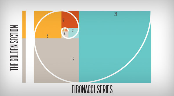
You can imagine how attractive a bold headline in the upper left corner, along with some small text, and a large image on the right, would be. It’s a pattern that human beings find innately attractive, and as of now, it’s not an often copied pattern. So it could serve your purposes well. Of course, this isn’t the only option for an attractive landing page, but it is a notable example of something interesting to consider when drawing up your initial design plans.
Color
Color is a huge part of what makes a landing page stand out. Colors have odd and sometimes unexpected effects on human psychology. We’ve touched on this point briefly in a former post, but it’s worth going over here in greater depth.
Certain colors evoke a variety of interesting emotional responses from human observers. The reason I asked you to note the colors your competitors are using earlier, was so that you can benefit from the knowledge of which colors are already attracting customers within your niche.
The topic of color choice is extremely subjective. Different marketing experiments show varying degrees of results in this regard. You can know that red is a color that incites appetite, anger, and energetic action, but that doesn’t mean that one of your visitors might equate it with heat, passion, and romance instead. Depending upon what you’re trying to sell, different color schemes can either help or hurt your cause. So be mindful of what you’re goals are and how the color scheme will compliment or conflict with them.
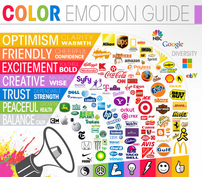
Here’s a general guide to color schemes and emotional responses:
Directional Cues
These are the markers you leave on your page to direct your visitors to their next actionable item. A directional cue can be something as simple as an arrow pointing toward your CTA. Or something more subtle, like an image featuring a tunnel toward that same CTA. You can even use images of people or animals staring in a certain direction to attract attention toward that path.
Either way, the eventual goal for every directional cue is to direct your viewer to their next course of desired action. So strategically place these markers around your page to create a sort of quasi-visual hierarchy. If you combine this with effective design, as well as interesting and well placed images, you’ll be able to manage your visitor’s eye contact with your web page.
Shapes
As we already established while discussing the Fibonacci sequence, certain shapes and patterns have a way of appealing to the human psyche. Knowing this, it’s easy to see how effective shape management on your landing page can create specific impressions in a client’s mind.
Squares and rectangles are the most commonly used shapes for web design. They nicely box in important information, and section off one item from another. No landing page would be complete without at least one rectangular area rationed out for a few product/service features or benefits.
These are the most utilitarian, and frankly the most useful of any shapes you can possibly use on your landing page. However, they are also the least sexy. This is why we need to discuss these next two shapes.
Triangles are basically arrows, dynamic and sexy arrows. I’ve already discussed arrows and the ability to direct attention. What I haven’t discussed is how arrows, aka triangles, are some of the most mysterious and attractive shapes available. Long considered a mystical formation, triangles draw associations to the pyramids of Egypt, Euclidian geometry, Pythagoras, and the creepy Freemason symbols on the backs of dollar bills.
It’s a shape with a mythic history and a prolific role in web design. These three pronged visual missiles can be a very powerful addition to your site and are always an elegant, eye catching option for any landing page.
Similar to the spiral pattern, circular shapes have a way of drawing our attention inwards. Funnels, tubes, tunnels, and rabbit holes all have the circular shape in common, and they all have the capability of pushing a consumer toward conversion.
You have to be careful with circles though, and all non-square shapes really. Don’t just spread them willy-nilly throughout your landing page. If you’re going to use a circular element, it must either be a single occurrence, or precisely placed in multiple locations. Otherwise your page will be too crowded and it’ll end up looking like a bowl of cheerios. Ironically enough, that’s not the most appetizing prospect.
Shape placement should be sparse and sensible. Keep an overall aesthetic vision in mind whether you’re dealing with circles, squares, triangles, rhombuses, or trapezoids.
Imagery
As far as powerful visual appeal goes, you’ll need to spend some time thinking about the imagery you’ll use on your landing page. The goal here is to be bold and grab attention, while still complimenting all of the other visual effects we’ve already discussed. You can do this with attractive but unobtrusive backgrounds, with vivid product images, or with other sorts of pictures that illustrate something about your product or service.
Traditionally effective imagery consists of things like landscapes, attractive people (men or women) performing some sort of activity, and especially popular are pictures of babies. Something about a baby really fires off signals in the reptile part of the human mind. We’re just hardwired to respond to a defenseless baby. Probably an evolutionary remnant from when they were getting jacked by dingoes and scary jungle cats back in prehistory.
Whatever the case may be, babies are a very cute and very visually appealing image that you could include to bring up those mushy maternal instincts in your client’s. After all, seeing a baby makes you remember the instinctual need to provide for your progeny. What better way to do that than purchase a much needed product or service?
This concludes our discussion of the visual elements of a successful high converting landing page. Check back next time when we’ll discuss the content and textual elements that every landing page needs to ensure mass conversions from their visitors.


Comment(s)0