
Helpful Hints for a High Converting Landing Page
Urgency-We’ve all seen this one before. “Buy now, before it’s too late!” Or how about this Ticketmaster staple: “You have 5 minutes to complete this order, or your tickets will be sold to someone else. Someone who doesn’t want to see Cher as badly as you!”
Yeah, I’m paraphrasing a bit. Artistic license, okay?
Still, you see the point. Using text to create a sense of urgency in the customer is an effective way of speeding up conversions. If time is money, then you want people to take the minimum time to type inover their credit card information. It’s like you’re getting paid twice.
Use incendiary color elements to aid in the illusion of urgency. Red text can be a powerful motivator, just think back to how mad it made you when your exams in high school came back all marked up like they’d been in a knife fight.
Scarcity-Since we’re already bringing back memories of high school for this illustration of textual power, try to bring your thoughts back to economics class. Think back to the old supply and demand curve. If the supply goes down, what does that do the demand?
It’s a simple psychological trick, but if you let it be known that there isn’t an overabundance of the resource you’re selling, the demand for said resources is certain to rise. Scarcity creates value, and it’s as simple as that. Convince your clients that supplies are running low, and pretty soon your overstock will be cleaned out entirely.
Free content-This is another concept that’s oft repeated in all of our marketing tips, but repetition isn’t conducted for its own sake. We repeat this a lot because it’s such a potent strategy: give your customers free content. Offer additional value to your call to action at no extra charge, and you make the customer feel smarter for buying from you. They’ve just gotten what they call a bargain, the best they’ve ever had! The Who would be proud.
"Buy today and receive a free eBook." "Purchase now and get free entry into our exclusive online webinar," and etc. Make sure you offer something of value to your customers at check out, and if you can’t do that, be sure to try and upsell them with similar products after the checkout process. You’ve got to try to remain helpful even after the conversion is made. That’s how you keep client’s loyal.
Testimonials-Once you’ve got a loyal customer, you might be able to garner some feedback from them. Positive feedback is often considered some of the most powerful advertising you can get your hands on. Glowing customer reviews of your product or service will convince other consumers to give it a try. Having these inconspicuously displayed near your checkout might just give the client who’s on the fence an extra push that they need to make that final purchase.
Content structure
Headlines-Headlines are a fairly complex business, considering how concise they’re supposed to be. There are, of course, hundreds if not thousands of different formulas for writing attractive headlines for your landing page. The difficult part is deciding what strategy is right for your product and your landing page.
If you’re using a long-form sales letter style, you can really push the length limits on your headline. Cleverly using conjunctions and punctuation marks to extend your sentences so that you may mention all the information you need. For example:
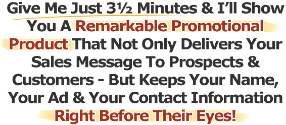
A lot of text and none of it's wasted. You know specifically what you're in for based on this text and you know you won't waste too much time.
However, there are a few things wrong with such a long headline. It's very specific and communicates a benefit, but it's also very long and it makes some pretty bold claims. For most ecommerce products, this isn’t a winning strategy. Instead, you’ll want to follow a few simple maxims that mirror many of the other tactics we’ve already discussed.
Keep it short and simple- You’re not trying to confuse your customers into buying, you’re trying to convince them. Highly specified niche markets can get away with longer headlines, but for the most part wordiness is frowned upon.
Keep to your point and be as succinct as possible. Rather than going on and on about the benefits of your product or service, use effective word choice and stick with syntax that’s packed with meaning.
For an example of powerfully crafted yet very terse writing, indulge me in a brief aside and think about Ernest Hemmingway. The great American author was a true master of bringing out the maximum amount of emotion from his reader’s with the minimum amount of space taken up.
Here’s a famous example of an extra short Hemmingway story. This message apparently started as a bet with a group of writers. Hemmingway claimed he could make a compelling and emotional story using only 6 words:
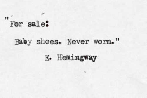
Ironically enough, this example though it is fiction, is technically still a sales headline. Not a particularly advisable one though. It’s probably best not to depress your audience. Still, it goes a long way in showing what great writing is capable of in less than 10 words.
Specificity is key- Though you’re trying to keep things short and simple, don’t let that stop you from discussing exactly what you want to get across. Use your headline to tell customers precisely what they’re here to see, and why it’s beneficial to them.
It may feel like this is asking a lot, but remember that effective word-craft can pack a lot of meaning into a small space. Look at this example of an effective headline for usability testing.
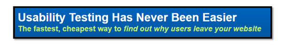
See how that works? A big headline advertising service and some small follow up text explaining the need for said service. It’s short, sweet, and specific. Two simple sentences that succinctly explain “what” and “why,” in such a way that doesn’t leave any room for confusion.
That’s everything you want from a headline. Also note that the banner is a soothing shade of blue, drawing a serene sort of contrast between the background and the bold white text. It clearly accomplishes the goal of informing the viewer of a need, while simultaneously putting them at ease, because there’s a solution to the problem, and it’s “never been easier.”
Scarcity again- Use your headlines to introduce an element of exclusivity to your product. If you’re offering something that a customer can get anywhere, why exactly would they decide to come to you? However, if this product is only available from your online store, that makes you the single producer in all the world of this particular valued quantity. Suddenly your offer seems that much more attractive.
Believability- Don’t promise the moon. If your headline is too over the top no one is going to take it seriously. So be honest, and ignore the impulse to embellish.
Beyond these 4 maxims, you’ll want to make sure your headline includes a well-researched keyword or keyword phrase. Other successful tactics you could try are:
- Including numbers: “5 tips to… 3 ways to ensure… Top 10 things to do in…”
- Use loaded language to describe your products: Free, How to, Top rated, Number one
- Action verbs: buy, subscribe, download, etc. It’s what you want your viewer to do.
Landing Page Web Copy
Virtually everything that we’ve covered with the headline can go double for the web copy. You still want to be brief, express a sense of exclusivity, urgency, and credibility. You should utilize your copy to bring more attention to the ways that your product or service can benefit the reader. That means taking the subject from your headline and breaking it down to specifics.
Use familiar language that doesn’t get so fancy it turns readers away. Rather keep to your point and don’t waste a word. Each sentence should build on the previous one, and all of them should be illustrating one of three things: a customer’s need for the product or service, a feature of the product or service that meets that need, or a benefit that your product or service provides the customer.
Once you’ve fully established the relevance of what you’re selling, it’s time to sell it. And for that we use Calls To Action.
CTA’s
You know the scene in the movie where the hero flicks the cigarette onto the ground, and the gas blazes up, and the entire building explodes while he walks away in slow motion, usually wearing sunglasses and a sweet leather jacket?
That’s what your Call To Action is like. It’s your landing page’s climax, the primer that builds into the explosive excitement that results in conversion.
Crafting a high converting call to action is like boiling down your landing page to its base elements, and putting it in a compact form designed to convince a user to convert. Think of your landing page as coal and your CTA should be the diamond composed of all the landing page’s compacted elements.
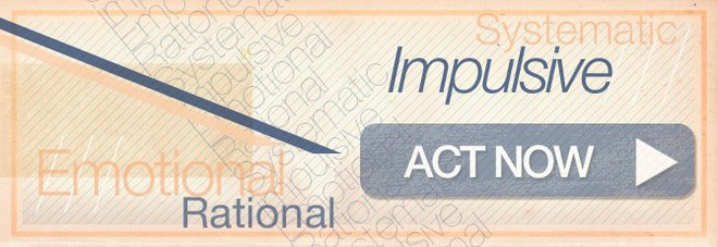
Your CTA needs to be urgent, express unique value, it should stand out from the rest of the page, point to a clear course of action using active verbs, (click here, subscribe now, etc.) and above all it must be relevant to everything else that your visitors have just read.
A landing page is a difficult project, but the rewards for doing one right are well worth the effort. You can have all the traffic in the world, but without a high converting landing page it’s all just a drain on your bandwidth. So stick to the fundamentals and keep up with the Ashop blog for more helpful hints about all things ecommerce.


Comment(s)0